I accredit a great deal of my success as an architectural photographer to Metropole Architects as it was Nigel Tarboton, one of their senior architects, who gave me the initial boost, a good few years ago now, in giving me opportunity to photograph one of their completed homes. I have never looked back and love the capture of architectural design.
It just so happens that, to date although they have had a great deal of concept work for commercial projects, I have only captured their residential projects and so have been waiting in eager anticipation to be able to showcase one of their commercial designs. This time has come and it has come in true Metropole style with a radical urban design within an old colonial area of Durban bringing a modern ‘twist’ to to a dated area – this property is being marketed for sale or to let by Custom Capital. The key to getting this design approved by the council, as Nigel explained to me, was the requirement of a pitched roof and a front patio or porch area. This design includes both but with a modern urban style that seriously will turn heads and folk are sure to notice this structure driving through the Morningside area. I sure was noticed while standing with tripod and camera on the centre of a fairly busy road during evening traffic – I had to get the required shot! You decide and the feedback is always welcome. Oh and thanks Dennis Guichard for the loan of the Lensbaby – loved it!
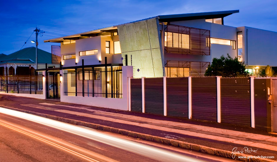
Here I'm standing in the middle of the road to capture the light trails and the building full frame
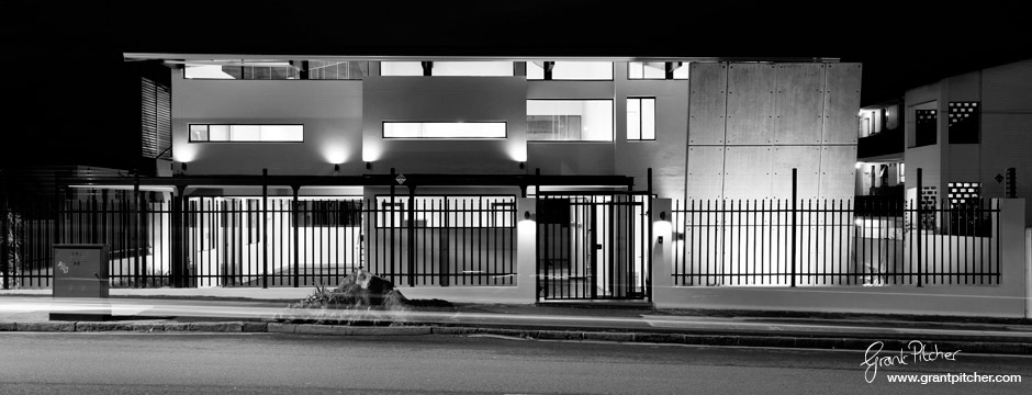
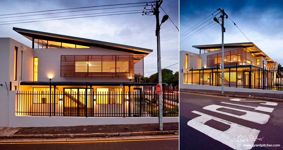
Great to be able to capture the urbanness of the location - street lamps and 'STOP' road signage to complete the picture!
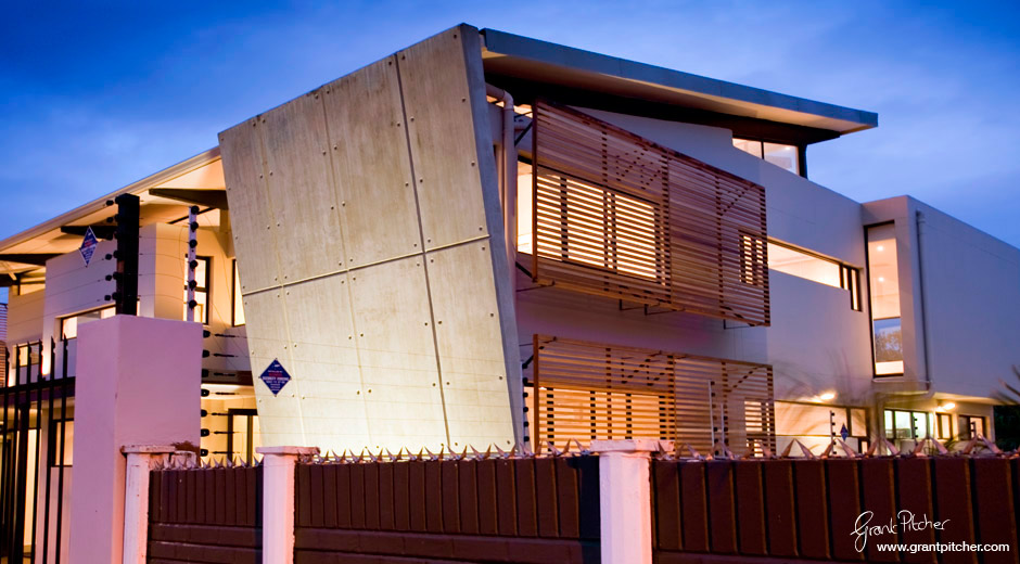
Introducing the sloping wall - just to be different
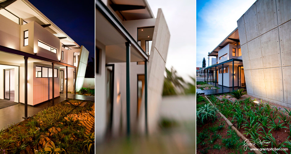
More imagery showing the entrance area and the sloping wall
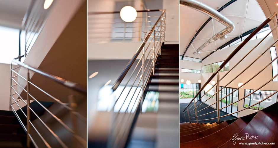
The staircases in each block of the building are enhancing features of the interior
Nice work Grant!! Love the viewpoints you achieved. The lensbaby shots are also very effective and give a great feel to the modern architecture
Yeah it’s great to use resources we have available to create a few extra WOW elements that set us apart from the conventional.
AWESOME, I love the architecture, I love that off-shutter concrete and I love those lensbaby shots of yours as they enable something really boring like balustrading to look quite sensational, well captured indeed. My fav image is the one with the STOP street painting in the foreground (nice lead-in line, nice foreground interest, nice balance of light).
Note to self: I MUST speak to lensbaby about some commission as it looks like that’s another one sold?
Yeah indeed Lensbaby should work on a comm structure! Difficult to get ‘right’ but when it comes together it is amazing. Photoshops effects to get that right would take hours. That image with the STOP signage is my favourite too. Picked that out in the pre-shoot brief and it so worked!